Blis Media
2019 -present
website migration, design, build and ongoing support
CREDITS –
Role: Product Design lead
Team: Fabrica Collective, Blis London
Copyrighting: Blis London
Year: 2019
MORE INFO –
The context
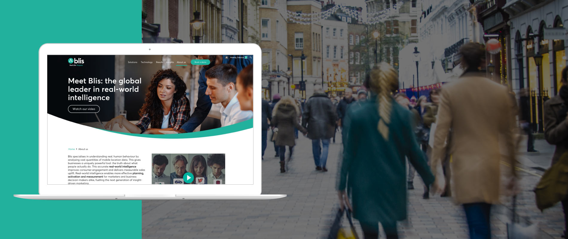
The Blis team wanted to redesign their website to better communicate their new identity. Their main goal was to communicate their brand positioning and message effectively while modernizing their look and feel.
The prior website had no distinct purpose, the main message on the homepage was not clear and they lacked a unique proposition.
Some other problems their site had were:
- Their messaging and branding were outdated.
- Their customer journey was fragmented.
- The content was repetitive and buried within pages.
- The imagery did not match the new branding style.
- The site is was not responsive/optimized for mobile.
- Easy way to maintain and add content to the site. Their team had no understanding of how to use WordPress and could not add content by themselves.
Objectives
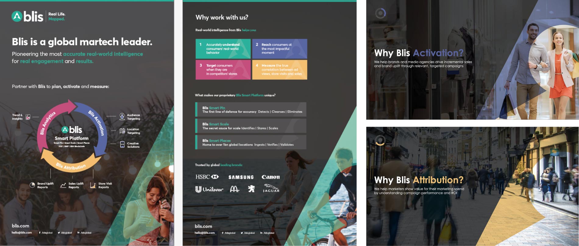
- New website design and structure should bring the new positioning to life and more clearly differentiate us in the marketplace as a martech leader. (use of video, case studies, insights)
- Bring ‘Real life. Mapped.’ to life – in imagery, tone of voice, etc
- Improve the customer journey, making it more intuitive and easy for our clients and prospects to find what they need and how Blis can help them.
- Better showcase the case studies
- Better showcase the insights content (consumer studies, white papers, infographics, etc)
- Drive and capture quality inbound leads
- Reduce loading time and therefore bounce rate on site
- Must be created with mobile in mind – well functioning responsive design
- Portray the company properly, in line with our brand values and personality
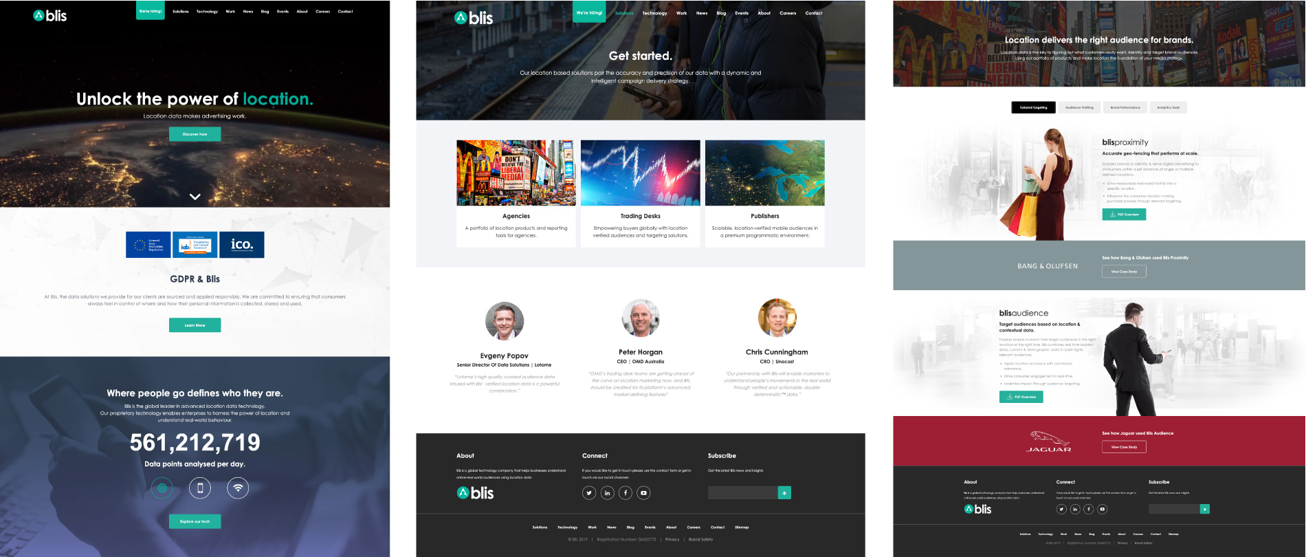
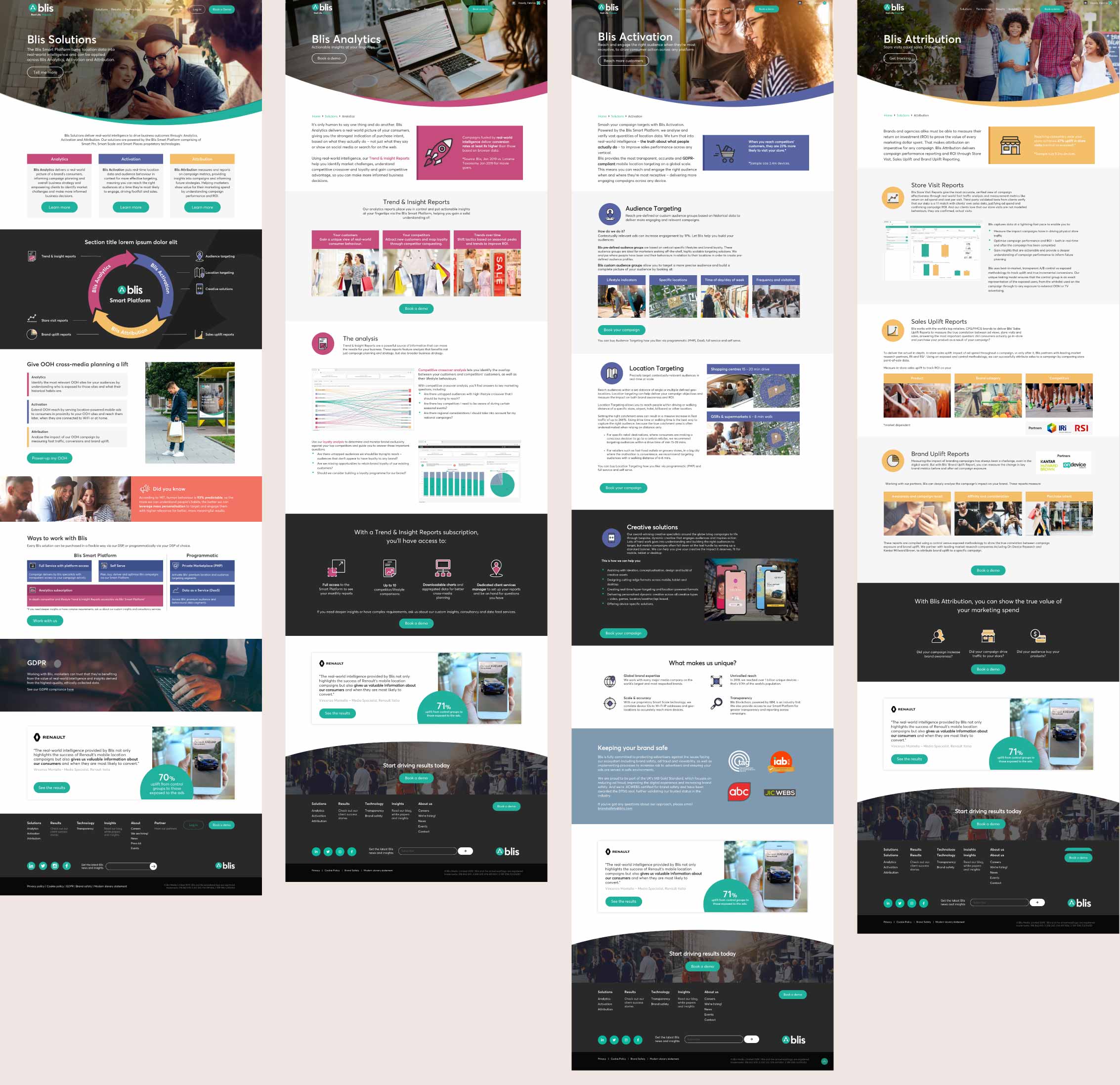
The Solution
We started with a workshop to set and prioritize objectives.
It was clear that current site users had difficulty understanding the offerings and what was unique about their technology.
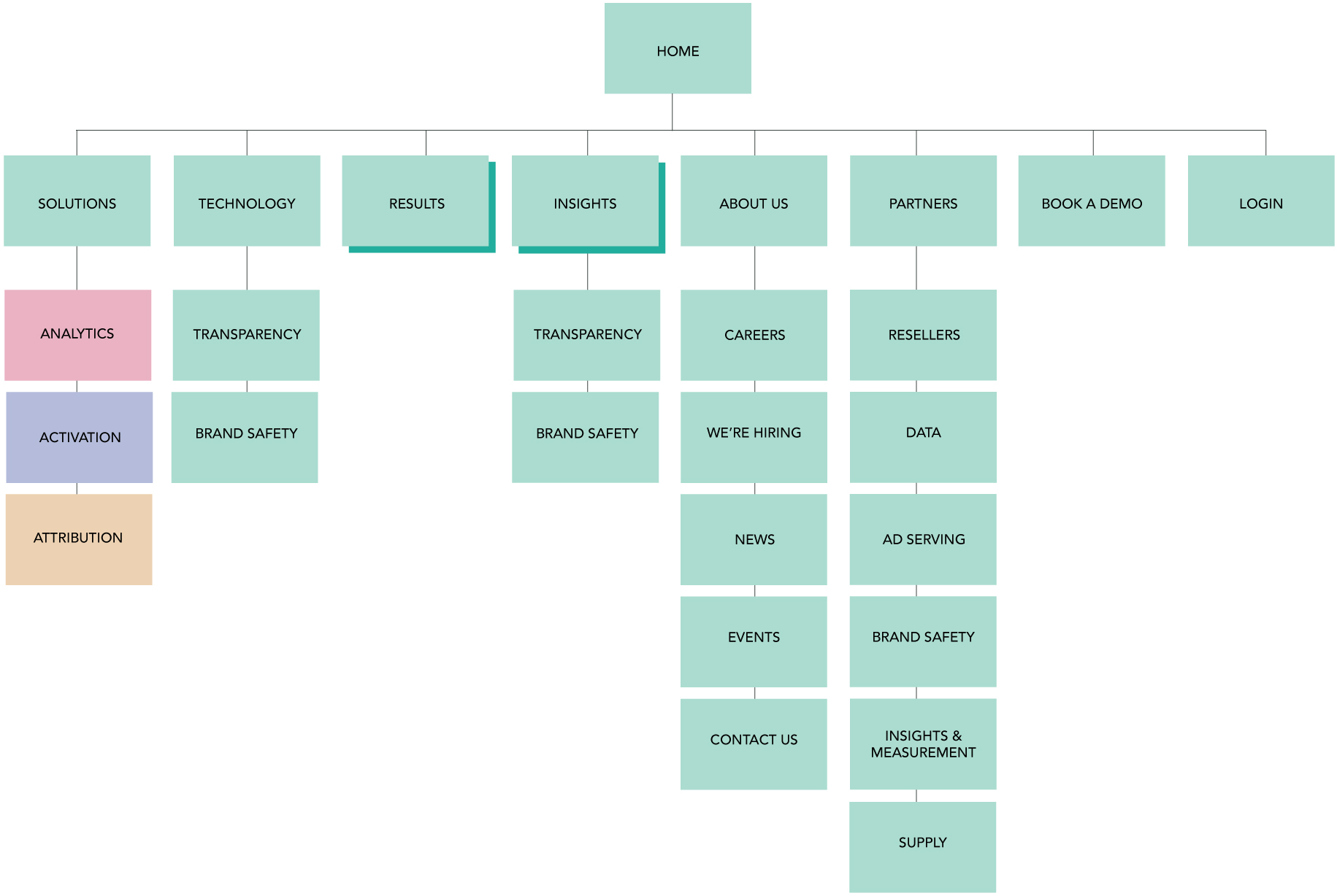
We developed several sitemap versions we finally landed on the most simple one:
- What Blis does (Solutions)
- How they do it (Technology)
- Implementation samples and success stories (Results)
- How their people think (Insights)
- Who they are (About)
- Who they partner with
- Contact
We assumed that if people are interested in looking for a job inside Blis, they will select the About page.
Same for office locations, they would select the contact section.
The Blis internal team tested the sitemap with clients and potential clients. Since the budget was small, we tried to partner as much as possible with their teams.
The brand guidelines and page organization
The brand guidelines and style Blis was using for their communications were not screen-friendly. Overall the visuals were hectic. The colors used had a problem with contrast, especially the purple over black, and the use of the keyhole was not a fast solution for different screen sizes.
We change the design direction to something much lighter, screen-friendly, and easier to digest.
Design & Build
The design was co-created between Blis’s internal team and Fabrica. Once the design direction was approved we worked directly on high fidelity screens (Illustrator & Sketch).
We tested a key set of screens with a small group of clients provided by the sales team. We also presented the designs to the leadership team at Blis in order to get final approval.
We built the site on a modular system, that way some modules are easily edited, replaced, or swapped.
Once we finally signed off on the build, we had a workshop instructing the team on how to update and work on their site. Up to date we continuously assist their team with site updates, bug fixes, new sections that require custom coding, adding GDPR consent form correctly…
The marketing and design teams are very appreciative of how we created the system since they are empowered to create new pages by themselves.
 by Elaine Keller